| Menu |
|
Main • Index Browse • Screenshots • Old News Submit • Screenshot • News Discuss • Forums |
| Search |
| Styles Packs |
| Download all 2693 styles upload to the site as of 08 February 2020! |
| Links |
Windows Shells   *nix Window Managers Blackbox FluxBox Styles NC-17 Pitkon To Us  |
| « Next | Homecoming by roninblade65 | Prev » | ||
 |
User | roninblade65 |
| Notes | ||
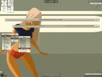
| This I based off the WP i got off of DeviantArt. Kinda made me think of a girl waiting at the docks/airport for her lover to come back from a war. Maybe its the green, kinda reminds me of military colors back when i was in boot camp. Anyway, my biggest question mark is the highlites - I used the colors from her shirt and shorts for contrast but i cna't make up my mind if I like them or not. | ||
| Shell | BBLC\BBLean | |
| Style | Homecoming | |
| Wallpaper | Hotpants | |
| Comments | |
| Inauro | Actually, i think you've picked a good colour range for the highlights. Perhaps trying a different gradient might make them appear a little less muddled though. You look to be using a horizontal gradient, why not try a flat vertical or something? Other than that, style looks great. |
| cthu1hu | IMO, to make the style look cohesive, you should only use a small number of colors, gradients and bevel types among all the elements. Maybe bout 3 types total. Like using the window title for the titlebar, the focused window label for the menu title, etc.. But that's just me, and I'm no expert. |
| Nightbreed | I see what he went for here, the color styles he used matches the color elements in the picture. Including the highlight in the menu, that to match the color of the shirt and shorts. All in all the colors in my opinion works with the desktop. |
|
© 2003-2006, Brian "Tres`ni" Hartvigsen, Jesterace, snkmchnb and NC-17 Styles © of their respective authors Please direct all administrative questions/comments to Jesterace, snkmchnb or NC-17 |
| Random Screenshot |
 ‡ • juztin • 1 |
| Style Switcher |
 • •
 • •
  • •
 • •

|
| Chatbox |
| Valid BBCode: [b][u][i][url] |
|
h3kt0r 2025-02-01 05:12 Greetings ! Just uploaded my first style : Jimi H thewayofzen 2025-01-29 14:51 its been quite some time friends. if any of the old crew is around you can find me on insta, x or wtv as neverwasteddays hope all are well ninfy 2025-01-26 03:26 wow blackbox4windows is downed but this site still up jqi 2025-01-20 21:41 main screen turn on ClockworkBastard 2025-01-02 11:00 Happy New YEAR! TO EVERYONE!!! Oh and a couple of christmases junkie 2024-11-22 10:16 hey boxorz! glad to see this site is still up and running. switched to mac a long time ago but cherish my boxing days for always. cheers! qwilk 2024-10-10 05:22 [exec] (MyScript) {@Script [@xoblite Random Wallpaper|@xoblite Toolbar ToggleOrientation]} yout 2024-10-09 12:30 Hello chatters! I just found this wonderful software called xoblite and installed it. I am very surprised that it is still developed as every other place around here seems to be dead. If you're reading this, please help me figure out how to set the clock to 12hr, and how to run a @Script from the menu. The docs say it is possible, but do not elaborate. welcome 2024-09-23 07:00 hello everybody my name is markpiler GSA 2024-09-16 14:36 Enjoying Xoblite in 2024! |
| Chatbox History |