| Menu |
|
Main • Index Browse • Screenshots • Old News Submit • Screenshot • News Discuss • Forums |
| Search |
| Styles Packs |
| Download all 2693 styles upload to the site as of 08 February 2020! |
| Links |
Windows Shells   *nix Window Managers Blackbox FluxBox Styles NC-17 Pitkon To Us  |
| « Next | Memory by Inauro | Prev » | ||
 |
User | Inauro |
| Notes | ||
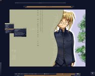
| Looks like this Megatokyo kick has yet to run it's course. Wallpaper by Kristen Perry (www.merekatcreations.com), Megatokyo by Fred Gallagher (www.megatokyo.com). | ||
| Shell | blackbox | |
| Style | Memory by Inauro | |
| Wallpaper | Mempiro by Kristen "Meerkat" Perry | |
| Comments | |
| Pitkon | Nice overall feel... I am not very sure about the balance between window label colors and toolbar colors, tho... |
| Inauro | Fair call. I was hesitant to use too much of the khaki/olive green colour because i thought i might be overwhelming. The blue was an obvious choice, but i thought a contrast using the strong skin tones might work. Maybe i'll tone it down at some stage. |
| Inauro | Just uploaded a recoloured version. Choice is always good. |
| Pitkon | The recolored version looks great, Inauro. Bravo! |
| Inauro | It does? I've not yet seen the screenshot. |
| Pitkon | Then what is this version I downloaded? Toolbar colors look quite different. |
| Inauro | The version linked on this page is the version seen in the screenshot. Any variance in colour is probably just due to the vagaries of changing a .bmp screenshot to a .jpg for uploading. The recoloured version that i uploaded this morning has completely reworked window.label and toolbar.label colours. |
|
© 2003-2006, Brian "Tres`ni" Hartvigsen, Jesterace, snkmchnb and NC-17 Styles © of their respective authors Please direct all administrative questions/comments to Jesterace, snkmchnb or NC-17 |
| Random Screenshot |
 ‡ • Taylor Fausak • 1 |
| Style Switcher |
 • •
 • •
  • •
 • •

|
| Chatbox |
| Valid BBCode: [b][u][i][url] |
|
h3kt0r 2025-02-01 05:12 Greetings ! Just uploaded my first style : Jimi H thewayofzen 2025-01-29 14:51 its been quite some time friends. if any of the old crew is around you can find me on insta, x or wtv as neverwasteddays hope all are well ninfy 2025-01-26 03:26 wow blackbox4windows is downed but this site still up jqi 2025-01-20 21:41 main screen turn on ClockworkBastard 2025-01-02 11:00 Happy New YEAR! TO EVERYONE!!! Oh and a couple of christmases junkie 2024-11-22 10:16 hey boxorz! glad to see this site is still up and running. switched to mac a long time ago but cherish my boxing days for always. cheers! qwilk 2024-10-10 05:22 [exec] (MyScript) {@Script [@xoblite Random Wallpaper|@xoblite Toolbar ToggleOrientation]} yout 2024-10-09 12:30 Hello chatters! I just found this wonderful software called xoblite and installed it. I am very surprised that it is still developed as every other place around here seems to be dead. If you're reading this, please help me figure out how to set the clock to 12hr, and how to run a @Script from the menu. The docs say it is possible, but do not elaborate. welcome 2024-09-23 07:00 hello everybody my name is markpiler GSA 2024-09-16 14:36 Enjoying Xoblite in 2024! |
| Chatbox History |