| Menu |
|
Main • Index Browse • Screenshots • Old News Submit • Screenshot • News Discuss • Forums |
| Search |
| Styles Packs |
| Download all 2693 styles upload to the site as of 08 February 2020! |
| Links |
Windows Shells   *nix Window Managers Blackbox FluxBox Styles NC-17 Pitkon To Us  |
| « Next | bubble boi by necroboi | Prev » | ||
 |
User | necroboi |
| Notes | ||
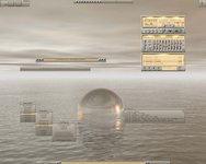
| This style was made for N-Log v2G winamp skin by Nucleo (link). The wallpaper is from my own archive from several years back, so the author and origin are unknown. | ||
| Shell | blackbox | |
| Style | n-log by necroboi (necroboi@mycybernet.net) | |
| Wallpaper | Silence | |
| Comments | |
| Jesterace | I like that everything seems together really well :) |
| necroboi | thanks Jestarace. this one was one of those styles that was just sitting around until i found that image. then it was like, "whoa!" (in my best Neo voice), hehe |
| Pitkon | Excellent, necroboi. N-log is one of my fav winamp skins and the style merges beautifully. As for the wallpaper, I think it's from mindscape, but I'm not positive... |
| frantic | Wall is just a typical "i've installed bryce and this is the first thing i did" kind of thing, but the n-log matching style was really a good idea. I think it would go better with some greyish metallic background. |
| El'Criticon | i hate that winamp skin!! is really ugly,,,!!! ARGh!!! |
| El'Ciritocn | mmmmmmmmmm about the wallpaper mmmmmmmmmm it sucks. nothing cool about it! |
| necroboi | thanks for the comments, guys =) ... El'Criticon: there's nothing 'great' about any of the individual components; this was just a themeing exercise (duh!) ... but i'll give you points for making me laugh today ;D |
| oldskull | hey thats cool, love the yellow things :) |
| El'Criticon | ey necroboi, its not you, its the winamp skin and the wallpaper. they suck , they are not inspiring. well take care dude |
| EngineCamel | Not inspiring...so what. Criticon, on something like this...I doubt anyone will care. I thought it looked cool. And so did everyone else. Instead of trashing the community, why not contribute to it... |
| EngineCamel | BTW where did you get that winamp skin. I needed something of a change from my dark set skins. |
|
© 2003-2006, Brian "Tres`ni" Hartvigsen, Jesterace, snkmchnb and NC-17 Styles © of their respective authors Please direct all administrative questions/comments to Jesterace, snkmchnb or NC-17 |
| Random Screenshot |
 Nightbreed • 12 |
| Style Switcher |
 • •
 • •
  • •
 • •

|
| Chatbox |
| Valid BBCode: [b][u][i][url] |
|
h3kt0r 2025-02-01 05:12 Greetings ! Just uploaded my first style : Jimi H thewayofzen 2025-01-29 14:51 its been quite some time friends. if any of the old crew is around you can find me on insta, x or wtv as neverwasteddays hope all are well ninfy 2025-01-26 03:26 wow blackbox4windows is downed but this site still up jqi 2025-01-20 21:41 main screen turn on ClockworkBastard 2025-01-02 11:00 Happy New YEAR! TO EVERYONE!!! Oh and a couple of christmases junkie 2024-11-22 10:16 hey boxorz! glad to see this site is still up and running. switched to mac a long time ago but cherish my boxing days for always. cheers! qwilk 2024-10-10 05:22 [exec] (MyScript) {@Script [@xoblite Random Wallpaper|@xoblite Toolbar ToggleOrientation]} yout 2024-10-09 12:30 Hello chatters! I just found this wonderful software called xoblite and installed it. I am very surprised that it is still developed as every other place around here seems to be dead. If you're reading this, please help me figure out how to set the clock to 12hr, and how to run a @Script from the menu. The docs say it is possible, but do not elaborate. welcome 2024-09-23 07:00 hello everybody my name is markpiler GSA 2024-09-16 14:36 Enjoying Xoblite in 2024! |
| Chatbox History |