| Menu |
|
Main • Index Browse • Screenshots • Old News Submit • Screenshot • News Discuss • Forums |
| Search |
| Styles Packs |
| Download all 2693 styles upload to the site as of 08 February 2020! |
| Links |
Windows Shells   *nix Window Managers Blackbox FluxBox Styles NC-17 Pitkon To Us  |
| « Next | screencap 2008 february by szekelya | Prev » | ||
 |
User | szekelya |
| Notes | ||
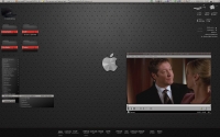
| This is my win2k laptop using BBClean, Samurize and Rocketdock. | ||
| Shell | BBLC\BBLean | |
| Style | ||
| Wallpaper | ||
| Comments | |
| iTiVO | The wallpaper puts me off and i think the style could use some refinement. But usability is certainly a plus on this screen. |
| szekelya | Well, the wall is up to your taste, I guess it wouldn't worth to argue about it. Usability of BB* (together with samurize that can and autohotkey scripts that can't be seen on the screenshot) makes computing a unique pleasure ever since I found BBclean. Just for the record, what refinement you'd recommend with the style? I think again that's the question of personal preferences, but I'm open to learn to be able to make better ones. |
| crowmag | Well, I like the wall. Sure beats a lot of the others I've seen posted lately IMO. I do think I would have done the toolbar and menu highlight more like the window title tho... |
| iTiVO | Personally i don't like "visible" window grips, meaning i like them to be either borderless or the borders being the same color as the rest of the handle. The contrast between shadow and actual font is a bit too much for me, too. The splitgradient on the focused window could have a little lower contrast as well. But that's just my two cents aka what i prefer in styles. D'ont get me wrong i don't think this is a bad ss or style. :) |
| /\/\inimal | Looks usable, but somehow the split gradient turns me off. Dunno. But the colors are nice and soft, really great. :D |
| hhhh | hello |
|
© 2003-2006, Brian "Tres`ni" Hartvigsen, Jesterace, snkmchnb and NC-17 Styles © of their respective authors Please direct all administrative questions/comments to Jesterace, snkmchnb or NC-17 |
| Random Screenshot |
 ‡ • owl |
| Style Switcher |
 • •
 • •
  • •
 • •

|
| Chatbox |
| Valid BBCode: [b][u][i][url] |
|
h3kt0r 2025-02-01 05:12 Greetings ! Just uploaded my first style : Jimi H thewayofzen 2025-01-29 14:51 its been quite some time friends. if any of the old crew is around you can find me on insta, x or wtv as neverwasteddays hope all are well ninfy 2025-01-26 03:26 wow blackbox4windows is downed but this site still up jqi 2025-01-20 21:41 main screen turn on ClockworkBastard 2025-01-02 11:00 Happy New YEAR! TO EVERYONE!!! Oh and a couple of christmases junkie 2024-11-22 10:16 hey boxorz! glad to see this site is still up and running. switched to mac a long time ago but cherish my boxing days for always. cheers! qwilk 2024-10-10 05:22 [exec] (MyScript) {@Script [@xoblite Random Wallpaper|@xoblite Toolbar ToggleOrientation]} yout 2024-10-09 12:30 Hello chatters! I just found this wonderful software called xoblite and installed it. I am very surprised that it is still developed as every other place around here seems to be dead. If you're reading this, please help me figure out how to set the clock to 12hr, and how to run a @Script from the menu. The docs say it is possible, but do not elaborate. welcome 2024-09-23 07:00 hello everybody my name is markpiler GSA 2024-09-16 14:36 Enjoying Xoblite in 2024! |
| Chatbox History |