| Menu |
|
Main • Index Browse • Screenshots • Old News Submit • Screenshot • News Discuss • Forums |
| Search |
| Styles Packs |
| Download all 2693 styles upload to the site as of 08 February 2020! |
| Links |
Windows Shells   *nix Window Managers Blackbox FluxBox Styles NC-17 Pitkon To Us  |
| « Next | Cryotron by ds9 | Prev » | ||
 |
User | ds9 |
| Notes | ||
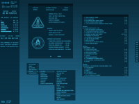
| The bbinterface panels on the left and on the right are shown just for the screenshot, normally those are set to autohide. | ||
| Shell | BBLC\BBLean | |
| Style | Cryotron by ds9 | |
| Wallpaper | bsetroot | |
| Comments | |
| clone | nice. looks pretty original |
| Reverend | Neat concept. I like it. |
| miqlas | Hello! Can You publish the .rc files of the BBInterface? And wich mediaplayer use You (Foobar?)? Thank You! |
| dpcdpc11 | great lookin shoot bro... clean and flat.. just how i like it!!! good work... just wondering what font are u using?? |
| cthu1hu | wow that's cool |
| ds9 | Uploaded the bbinterface config , its for bbinterfaceMod_iTunes_0.9.9k9c, and yes, I use foobar. The font is Swis721 Cn BT D-Type. |
| ds9 | Uploaded the bbinterface config , its for bbinterfaceMod_iTunes_0.9.9k9c, and yes, I use foobar. The font is Swis721 Cn BT D-Type. |
| dpcdpc11 | thanks for the info mate!! |
| Pitkon | Looks great - and I like the bar :) |
| crowmag | Nice dark yet 'readable' style, COOL systems dialog mod. It's kinda hard to tell where the window.buttons are and I think I would use the menu.active.backgroundColor for Window Frame as well as a very faint 3D Object Highlight and 3D Object Shadow in the 3DC, but that's just me. A really well thought out and creative desktop if you ask me. SCORE: 9.9 FTW :D |
| qwilk | Really nice screenshot to showcase the style - and given that slightly disappointing when applied on my box. The style mixes old and new style syntax and elements such as the toolbar button definitions seem to be missing. Oh, and everything looks nicely interlaced in the screenshot, but I reckon that's due to alpha transparency? The font colour also looks quite a bit brighter in reality than in the screenshot, but again I reckon this could be due to alpha transparency. Anyway, just some constructive feedback - nice work! |
| ds9 | Yes, I realized after submitted the screenshot that it can be a little bit misleading, because the use of transparency. The colors are set to look good with transparent windows. I really dont like window borders, so I use transparency to avoid the blending of windows when they are overlapping, like on this screenshot. |
| anime-addict | Can you share some wisdom on how you realized to get the file manager the way it looks? |
| anime-addict | Can you share some wisdom on how you realized to get the file manager the way it looks? |
| ds9 | The screen layout elements of total commander can be turned off on the configuration/layout panel. I disabled every gui elements (button bar, drive buttons, etc.). To switch off the menu bar, create an empty file called no.mnu, and change the main menu file on the configuration/language panel to this empty file. And finally, set the "RestrictInterface" value to 1 in the wincmd.ini file to get rid of the remaining menu :) |
| cthu1hu | That's some of the best customizing I've seen. What is the text editor in your second shot? |
| cthu1hu | Never mind, looks like notepad :P |
| ds9 | Metapad :) |
| anime-addict | i'll give that a try, really nice tweaks! :-) thx ds9! |
|
© 2003-2006, Brian "Tres`ni" Hartvigsen, Jesterace, snkmchnb and NC-17 Styles © of their respective authors Please direct all administrative questions/comments to Jesterace, snkmchnb or NC-17 |
| Random Screenshot |
 almostX |
| Style Switcher |
 • •
 • •
  • •
 • •

|
| Chatbox |
| Valid BBCode: [b][u][i][url] |
|
h3kt0r 2025-02-01 05:12 Greetings ! Just uploaded my first style : Jimi H thewayofzen 2025-01-29 14:51 its been quite some time friends. if any of the old crew is around you can find me on insta, x or wtv as neverwasteddays hope all are well ninfy 2025-01-26 03:26 wow blackbox4windows is downed but this site still up jqi 2025-01-20 21:41 main screen turn on ClockworkBastard 2025-01-02 11:00 Happy New YEAR! TO EVERYONE!!! Oh and a couple of christmases junkie 2024-11-22 10:16 hey boxorz! glad to see this site is still up and running. switched to mac a long time ago but cherish my boxing days for always. cheers! qwilk 2024-10-10 05:22 [exec] (MyScript) {@Script [@xoblite Random Wallpaper|@xoblite Toolbar ToggleOrientation]} yout 2024-10-09 12:30 Hello chatters! I just found this wonderful software called xoblite and installed it. I am very surprised that it is still developed as every other place around here seems to be dead. If you're reading this, please help me figure out how to set the clock to 12hr, and how to run a @Script from the menu. The docs say it is possible, but do not elaborate. welcome 2024-09-23 07:00 hello everybody my name is markpiler GSA 2024-09-16 14:36 Enjoying Xoblite in 2024! |
| Chatbox History |