| Menu |
|
Main • Index Browse • Screenshots • Old News Submit • Screenshot • News Discuss • Forums |
| Search |
| Styles Packs |
| Download all 2693 styles upload to the site as of 08 February 2020! |
| Links |
Windows Shells   *nix Window Managers Blackbox FluxBox Styles NC-17 Pitkon To Us  |
| « Next | chocolate swim by doctorfrog | Prev » | ||
 |
User | doctorfrog |
| Notes | ||
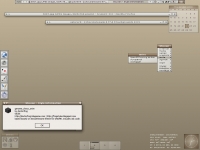
| in progress. it's a bit mono at the moment. i welcome any suggestions to spice it up a bit. | ||
| Shell | BBLC\BBLean | |
| Style | genome_choco_swim by doctorfrog | |
| Wallpaper | bsetroot | |
| Comments | |
| snkmchnb | nice so far. i'm not real keen on the active window buttons, i would make them parentrelative.. but that's just me |
| Reverend | Heh. Very Ubuntu-ish. |
| ArthurDent | I agree with snk about the active window buttons.. Is there some incantation that would put a border around those? That would make it better. Other than that , though, I think it looks really good, and doesn't really need any spicing up! I really like the look of the window label. Very understated. |
| doctorfrog | yeah, wish there was a way to add a quick border to the buttons, because the bevel choices don't look so hot and i don't want the buttons to sink into the already featureless window label. |
| snkmchnb | two things i would recommend to try: -make the buttons the same as the menu highlight -make the buttons the same as the inactive window label |
| skwire | You can easily add a border around those buttons by changing this line in the style: window.button.focus: flat gradient vertical Change it to: window.button.focus: flat gradient vertical border |
| doctorfrog | thanks, skwire! i'll give it a shot. |
|
© 2003-2006, Brian "Tres`ni" Hartvigsen, Jesterace, snkmchnb and NC-17 Styles © of their respective authors Please direct all administrative questions/comments to Jesterace, snkmchnb or NC-17 |
| Random Screenshot |
 ‡ • Jesterace • 3 |
| Style Switcher |
 • •
 • •
  • •
 • •

|
| Chatbox |
| Valid BBCode: [b][u][i][url] |
|
h3kt0r 2025-02-01 05:12 Greetings ! Just uploaded my first style : Jimi H thewayofzen 2025-01-29 14:51 its been quite some time friends. if any of the old crew is around you can find me on insta, x or wtv as neverwasteddays hope all are well ninfy 2025-01-26 03:26 wow blackbox4windows is downed but this site still up jqi 2025-01-20 21:41 main screen turn on ClockworkBastard 2025-01-02 11:00 Happy New YEAR! TO EVERYONE!!! Oh and a couple of christmases junkie 2024-11-22 10:16 hey boxorz! glad to see this site is still up and running. switched to mac a long time ago but cherish my boxing days for always. cheers! qwilk 2024-10-10 05:22 [exec] (MyScript) {@Script [@xoblite Random Wallpaper|@xoblite Toolbar ToggleOrientation]} yout 2024-10-09 12:30 Hello chatters! I just found this wonderful software called xoblite and installed it. I am very surprised that it is still developed as every other place around here seems to be dead. If you're reading this, please help me figure out how to set the clock to 12hr, and how to run a @Script from the menu. The docs say it is possible, but do not elaborate. welcome 2024-09-23 07:00 hello everybody my name is markpiler GSA 2024-09-16 14:36 Enjoying Xoblite in 2024! |
| Chatbox History |