| Menu |
|
Main • Index Browse • Screenshots • Old News Submit • Screenshot • News Discuss • Forums |
| Search |
| Styles Packs |
| Download all 2693 styles upload to the site as of 08 February 2020! |
| Links |
Windows Shells   *nix Window Managers Blackbox FluxBox Styles NC-17 Pitkon To Us  |
| « Next | cr8 by clovemagic | Prev » | ||
 |
User | clovemagic |
| Notes | ||
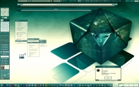
| Been playing around with this one. All .70 syntax. 3dcc included in the style file. | ||
| Shell | BBLC\BBLean | |
| Style | cr8 by clovemagic | |
| Wallpaper | cube_3_by_strasza | |
| Comments | |
| Nightbreed | Very nice Clove, Has that calm classic feel to it... BTW, have you tried making tabs with bbi and transparancy options ;D |
| crowmag | Wow, most excellent clovemagic, you really out done your self on this one! Plus, it's in green =D |
| blackbird | Hi Clovemagic, Realy nice wallpaper. did you have an url for this? |
| Shawan | Still a very nice style, I love the colour and the wall :) All this made without Stylemaker I'm impressed... |
| Pitkon | Beautiful, clove! Just beautiful! |
| clovemagic | Thanks everyone! Nightbreed: I haven't had much chance to play around with it yet, but I'll give it a shot soon. blackbird: I tried to find the URL for the wall, but I was not successful. I think it was on DA, but a search there proved fruitless. I'll post it if I can find it. |
| Sha1 | I think the wall can be found here -> link |
| Sha1 | Sorry it didn't work (I'm hopeless) second test -> link |
| Sha1 | lol I've never seen more useless person in computers than me, the wall can be found on link next time I'll let do profossionals... (sorry for all the useless comments) |
| Nightbreed | You're not useless, atleast you found it. I gave up after 2 no shows on google.... lol... guess my patients aren't what they use to be... hehe |
| Nightbreed | in fact, I kept coming up with rubix cubes.. :D |
| shawan | Lol NB (Nightbreed is too long) actually the third time was not supposed to work but now I've eventually understood how to make a link on boxshot :D |
| clovemagic | Thanks for the link, Shawan (and NB for trying ;D). I don't know what the problem was when I searched. Maybe NB's patients are giving me trouble too. :-D |
| Pitkon | Doctor Breed, please restrain ur patients... :D |
| Nightbreed | lmao... my kind of restraint would get me kicked out of the hospital... hehehe |
| clovemagic | @Pitkon: LMAO |
| cthu1hu | You put a lot into your styles. And the fact that you make them by hand is crazy I think ;) Really nice job all around. The non-standerd font is kind of a pain, but I'm not one to talk. |
| jimmy | Great style, imho it perfectly matches with the wallpaper... The only thing I would have done in a different way is the menu.hilite color (is it solid? )... Anyway it's beautiful :) |
| clovemagic | Thanks much, cth1hu. :D Thank you too, Jimmy. Yes, the menu highlight (or menu.active in .70 speak) is a solid color. It actually looks a shade darker on my screen. Looking at the screenie, I think I'd go even a bit darker now. Thanks for the constructive criticism. :-D |
| jimmy | You're wellcome clovemagic ;-) |
|
© 2003-2006, Brian "Tres`ni" Hartvigsen, Jesterace, snkmchnb and NC-17 Styles © of their respective authors Please direct all administrative questions/comments to Jesterace, snkmchnb or NC-17 |
| Random Screenshot |
 downsouth |
| Style Switcher |
 • •
 • •
  • •
 • •

|
| Chatbox |
| Valid BBCode: [b][u][i][url] |
|
qwilk 2024-10-10 05:22 [exec] (MyScript) {@Script [@xoblite Random Wallpaper|@xoblite Toolbar ToggleOrientation]} yout 2024-10-09 12:30 Hello chatters! I just found this wonderful software called xoblite and installed it. I am very surprised that it is still developed as every other place around here seems to be dead. If you're reading this, please help me figure out how to set the clock to 12hr, and how to run a @Script from the menu. The docs say it is possible, but do not elaborate. welcome 2024-09-23 07:00 hello everybody my name is markpiler GSA 2024-09-16 14:36 Enjoying Xoblite in 2024! pitkon 2024-09-12 23:16 Still alive and kickin... coolmccooldude 2024-08-10 11:40 To the webmaster: keep it up, we ? you!! yeloxp 2024-07-29 12:23 holy shit how is this site still active... Popp 2024-07-23 11:40 Hej rittan!!! bbzero download 2024-03-31 07:41 link hi! 2024-03-14 17:36 woooah this is so cool |
| Chatbox History |