| Menu |
|
Main • Index Browse • Screenshots • Old News Submit • Screenshot • News Discuss • Forums |
| Search |
| Styles Packs |
| Download all 2693 styles upload to the site as of 08 February 2020! |
| Links |
Windows Shells   *nix Window Managers Blackbox FluxBox Styles NC-17 Pitkon To Us  |
| « Next | kill the buddha by thewayofzen | Prev » | ||
 |
User | thewayofzen |
| Notes | ||
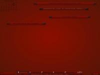
| Some have said that in order to know the buddha u must kill the buddha. I guess its a suitable name for a style thats blood red. I hope someone finds this useful.. i really like it although im not sure how often i would actually want to look at colors this bright. More then anything it was an exercise in using a color other then blue or grey.. Enjoy Zen | ||
| Shell | xoblite | |
| Style | kill the buddha by thewayofzen | |
| Wallpaper | bsetroot | |
| Comments | |
| thewayofzen | wow this looks like crap in this jpg. |
| Rev | Yeah. Red just doesn't compress well at all. Why? I couldn't really tell you. ~l~ This style reminds me, vaguely, of my Gottin Himmel style.. it, too, is very red. Not one I use very often, to be sure. ~l~ |
| sysboo | I like the color choices and gradient work though. The font seems kinda hard to read with the black on red, but i still find this interesting. I don't think this one would help my inner harmony though :) |
| thewayofzen | this really isnt so bad when u actually use it. if u go purely by the screenie the font is fuzzier then it would be otherwise. |
| winder | The gradients and all look cool. I'm thinking that loosing the bsetroot wall and getting a clearer one (say, something whiteish with traces of red) would make it easier on the eyes ... |
| jegHegy | red is compressed more by default in jpegs because red is perceived at a lower detail in the human eye as well. not by this much though ;] Paint Shop Pro's JPEG exporter for example lets you set the ratio in which red, green, and blue is compressed. |
|
© 2003-2006, Brian "Tres`ni" Hartvigsen, Jesterace, snkmchnb and NC-17 Styles © of their respective authors Please direct all administrative questions/comments to Jesterace, snkmchnb or NC-17 |
| Random Screenshot |
 ‡ • sidewinder • 1 |
| Style Switcher |
 • •
 • •
  • •
 • •

|
| Chatbox |
| Valid BBCode: [b][u][i][url] |
|
h3kt0r 2025-02-01 05:12 Greetings ! Just uploaded my first style : Jimi H thewayofzen 2025-01-29 14:51 its been quite some time friends. if any of the old crew is around you can find me on insta, x or wtv as neverwasteddays hope all are well ninfy 2025-01-26 03:26 wow blackbox4windows is downed but this site still up jqi 2025-01-20 21:41 main screen turn on ClockworkBastard 2025-01-02 11:00 Happy New YEAR! TO EVERYONE!!! Oh and a couple of christmases junkie 2024-11-22 10:16 hey boxorz! glad to see this site is still up and running. switched to mac a long time ago but cherish my boxing days for always. cheers! qwilk 2024-10-10 05:22 [exec] (MyScript) {@Script [@xoblite Random Wallpaper|@xoblite Toolbar ToggleOrientation]} yout 2024-10-09 12:30 Hello chatters! I just found this wonderful software called xoblite and installed it. I am very surprised that it is still developed as every other place around here seems to be dead. If you're reading this, please help me figure out how to set the clock to 12hr, and how to run a @Script from the menu. The docs say it is possible, but do not elaborate. welcome 2024-09-23 07:00 hello everybody my name is markpiler GSA 2024-09-16 14:36 Enjoying Xoblite in 2024! |
| Chatbox History |