| Menu |
|
Main • Index Browse • Screenshots • Old News Submit • Screenshot • News Discuss • Forums |
| Search |
| Styles Packs |
| Download all 2693 styles upload to the site as of 08 February 2020! |
| Links |
Windows Shells   *nix Window Managers Blackbox FluxBox Styles NC-17 Pitkon To Us  |
| « Next | evo by w-yosh-c | Prev » | ||
 |
User | w-yosh-c |
| Notes | ||
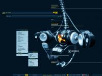
| Wallpaper by Oliver Dawson, link | ||
| Shell | BBLC\BBLean | |
| Style | evo by w-yosh-c | |
| Wallpaper | Envision_X | |
| Comments | |
| NC-17 | nice use of colours here. |
| frantic | The colors are nice, however I think that a flat style is not the best choice for a 3D wall. BTW that Oliver Dawson guy makes some great 3D stuff, nice link. |
| pHarciDe | nice nice nice theme, but the link to the wall doesn't work, wheni search on google all i find is a band named Oliver/Dawson. any other links? |
| Nightbreed | pHarciDe: You should see an animated menu when you get on the site, there's a wallpaper link there. Another great theme w-yosh-c |
| pHarciDe | hmm i wonder whats wrong then, when i try to click on the link or copy paste, ect but keep getting 404 error |
| Nightbreed | Maybe you need to update your flash and make sure you dont have anything blocking pop ups |
| Inauro | I really like the strong contrast between the yellow buttons and the dark blue bars. Looks good, w-yosh-c. |
| xMonKeyx | Oh yeah! Love this one. Using it now and I can see myself keeping it around for awhile. Great work. |
| cLess-R34 | I actually love the fact that the wallpaper is 3D and volumetric, while the menus are flat. Makes a sweet effect to me. Rocks. |
|
© 2003-2006, Brian "Tres`ni" Hartvigsen, Jesterace, snkmchnb and NC-17 Styles © of their respective authors Please direct all administrative questions/comments to Jesterace, snkmchnb or NC-17 |
| Random Screenshot |
 Aleni Mesch • 1 |
| Style Switcher |
 • •
 • •
  • •
 • •

|
| Chatbox |
| Valid BBCode: [b][u][i][url] |
|
h3kt0r 2025-02-01 05:12 Greetings ! Just uploaded my first style : Jimi H thewayofzen 2025-01-29 14:51 its been quite some time friends. if any of the old crew is around you can find me on insta, x or wtv as neverwasteddays hope all are well ninfy 2025-01-26 03:26 wow blackbox4windows is downed but this site still up jqi 2025-01-20 21:41 main screen turn on ClockworkBastard 2025-01-02 11:00 Happy New YEAR! TO EVERYONE!!! Oh and a couple of christmases junkie 2024-11-22 10:16 hey boxorz! glad to see this site is still up and running. switched to mac a long time ago but cherish my boxing days for always. cheers! qwilk 2024-10-10 05:22 [exec] (MyScript) {@Script [@xoblite Random Wallpaper|@xoblite Toolbar ToggleOrientation]} yout 2024-10-09 12:30 Hello chatters! I just found this wonderful software called xoblite and installed it. I am very surprised that it is still developed as every other place around here seems to be dead. If you're reading this, please help me figure out how to set the clock to 12hr, and how to run a @Script from the menu. The docs say it is possible, but do not elaborate. welcome 2024-09-23 07:00 hello everybody my name is markpiler GSA 2024-09-16 14:36 Enjoying Xoblite in 2024! |
| Chatbox History |